The Starting Point of Standarizing
It all began when I worked on the Enterprise squad, a team whose features are reused by many other verticals. Since 80% of our work supports others, we needed to make sure everything runs smoothly before it gets shared.
01
Component inconsistency across Pintar
Every team seemed to have their own version of 'table design'—leading to a UI patchwork that confused users and drained design consistency.
02
03
Pixel-Perfect Maintenance Struggles
Maintaining pixel perfection in complex tables felt like walking a tightrope—any small change risked breaking the whole layout.
04
High Learning Curve for Designers
Other designers often felt lost, needing extra time just to understand how to reuse or adapt table components.
Outlining the strategy
We gathered interns from each squad to work on a project that wasn’t part of the main sprint plan. During our meetings, we aligned on a dedicated timeline tailored for the interns' involvement.
1
Alignment meeting
Shared objective, expectations, and problem clarity.
2
Insight Collection
Gathering real cases and pain points from cross-vertical teams.
3
Visualizing the system to understand relationships between components.
4
Alignment meeting
Shared objective, expectations, and problem clarity.
5
Documentation
6
Monitor & Measure
Tracking usage, collecting feedback, and iterating based on real impact.
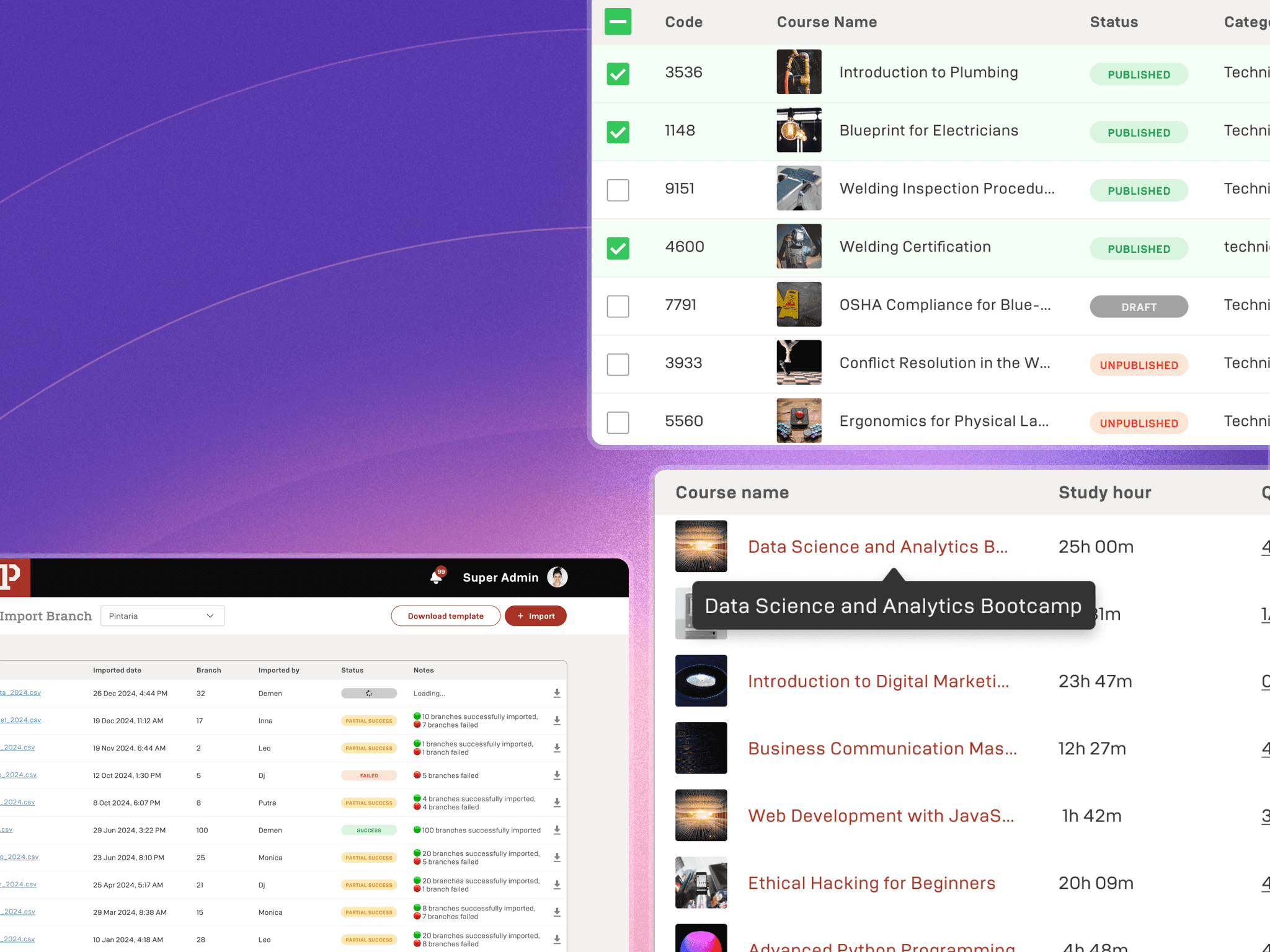
1 platform, 4 verticals, 8 table types
We began reviewing our design environment across different verticals and discovered inconsistencies and misuse of components, causing them to function poorly. This led us to a deeper understanding of what our table component truly needs to work effectively. Here are some of the things in our table:

Consistent Look, Flexible Purpose
Even though each table serves a different function, they all share a unified visual style—making the overall design feel cohesive across the platform.
Customizable for Complex Needs
The components are easy to tweak and adapt, allowing us to support more complex use cases as the product grows—without starting from scratch.
Cracking the Pattern
A deep dive into how we tackled table consistency by discovering patterns, defining structures, and building flexible components.
Table Structure
We started by identifying the common building parts of all the tables—headers, title row, table body, and footer—laying the foundation for a scalable table system.

Header
This section appears above the actual table. It provides context, actions, or filters for the dataset displayed below.
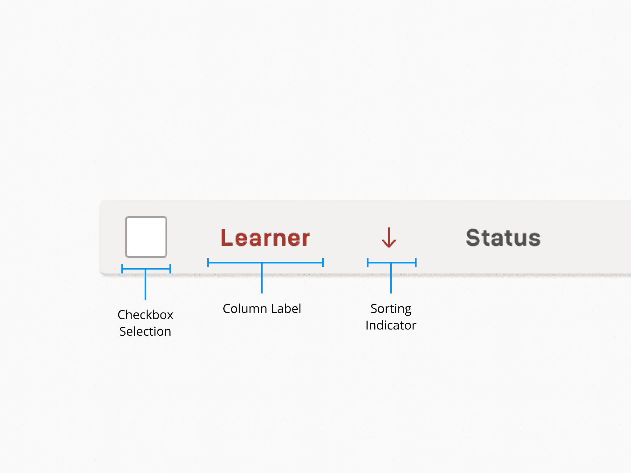
Head
This is the first row of the table, defining the names and structure of each column.

Body
The main part of the table that displays data rows.
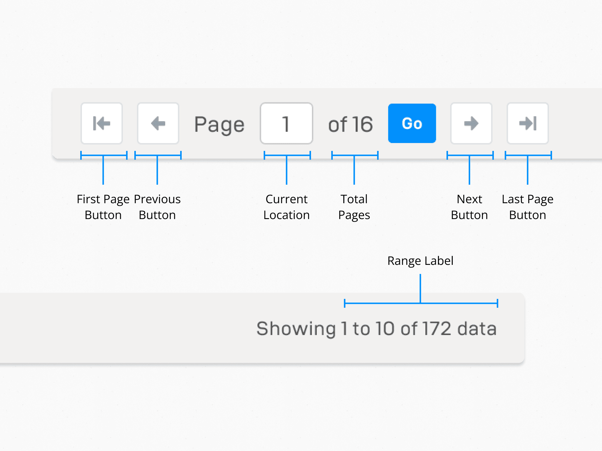
Footer
Located below the table, this section manages pagination and gives data overview.
Variants
From simple lists to action-heavy data tables, we explored variant components for each table list to accomodate multiple use cases and created flexible variants to suit different needs.

Final Components
After rounds of iteration, we landed on a unified table component that’s easy to use, consistent, and ready for future complexity.
Key Improvements
After launching the table component, we encouraged design teams to use it in their verticals and refer to the guidelines. We also tracked its delivery time and satisfaction in the first 3 months.
And the results are: