Product Designer

Jakarta, Indonesia

|

1:23 PM

Product Designer

Jakarta, Indonesia

|

1:23 PM

Product Designer

Jakarta, Indonesia

|

1:23 PM

Role:

Modern Eats

Scope:

UI Design, Branding

Field:

E-commerce

Timeline:

2024

Role:

Modern Eats

Scope:

UI Design, Branding

Field:

E-commerce

Timeline:

2024

Redesigning network analysis experience

As the platform grew, so did our users. We refined the interface to feel simpler and more welcoming, ensuring even non-tech-savvy users could navigate with ease and confidence.

Role:

UI/UX Designer

Scope:

Redesign Mobile Application

Field:

Telecommunication

Timeline:

Q3 2020 - Q1 2020

Overview

Signal Test is a product developed by PT. Immobi Solusi Prima for tracking network performance in specific areas using geolocation. This application is a redesigned version of “Signal Viewer,” which was initially released around 2018and primarily used by internal technicians for field testing and monitoring.

In 2020, the app was rebranded and officially published on the Google Play Store, expanding its reach to the general public. It was marketed as a useful tool for Indonesian users traveling to their hometowns (mudik), especially in remote or rural areas, to help them monitor and report network quality easily.

Exploration

We are planning to new branding of previous version app and rearrangement of existing features in the application. After exploring “Signal Viewer”, I tried all the features and found things that can be redesign to improve the branding of the app itself.

Pain
Points

Unknown all existing feature

Unknown all existing feature

Incomprehensible information

Complex flow

How Might We (HMW)

Organize these features and create a menu that makes it easy for users to access all the features easily?

Provide information more structured, clear, and easy to understand to reduce misunderstanding?

Create an easy way to user all existing features that is efficient and easy to understand so it doesn’t make users get lost when use app?

Pain
Points

Unknown all existing feature

Incomprehensible information

Complex flow

How Might We (HMW)

Organize these features and create a menu that makes it easy for users to access all the features easily?

Provide information more structured, clear, and easy to understand to reduce misunderstanding?

Create an easy way to user all existing features that is efficient and easy to understand so it doesn’t make users get lost when use app?

Comparison with existing UI

After identifying key usability challenges, our design direction focused on simplifying interaction and improving readability. We aimed to make network testing effortless and intuitive for both technical and non-technical users.

We reimagined the app’s structure from the ground up — turning overwhelming layouts into clear, guided experiences. The new design features a clean dashboard, easier access to key functions, and a smoother flow for testing and monitoring signals.

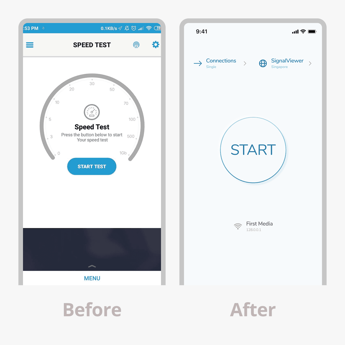
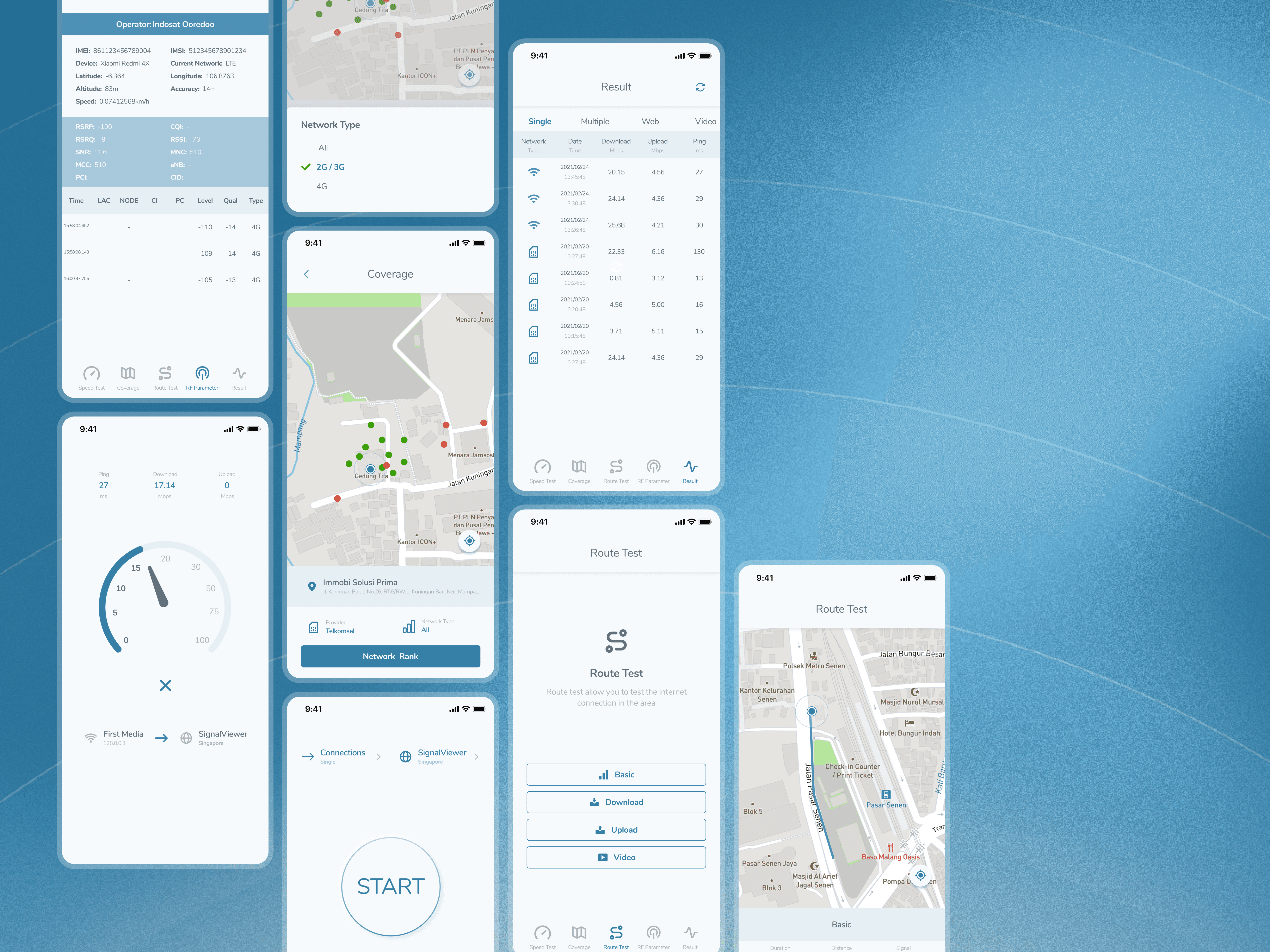
Home and Speed test page

Modern and Simplify UI to focus on the main features
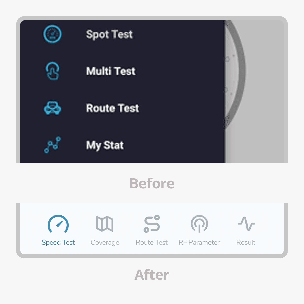
Menu section

Navigation bottom menu to simplify structure main features

RF Parameter

RF Parameter

RF Parameter

Tidier structure for ease in reading data

Coverage

Simplify options by separating the network and operator options into different modals.

Final Thoughts

Through the redesign of the Signal Test app, our primary goal was to simplify a previously complex interface and make it more intuitive for general users. We focused on improving readability, streamlining navigation, and presenting technical data in a way that feels approachable and clear.

Final Thoughts

  1. Clear Visual Indicators – Used color coding and icons to help users quickly interpret signal strength and performance status.

  2. User-Friendly Terminology – Replaced technical words with plain language to make the app accessible to non-technical users.

  3. Modern & Clean Design System – Adopted a consistent visual style and typography to enhance legibility and create a trustworthy experience.

Role:

Modern Eats

Scope:

UI Design, Branding

Field:

E-commerce

Timeline:

2024

Role:

Modern Eats

Scope:

UI Design, Branding

Field:

E-commerce

Timeline:

2024

© 2025 Dhesign

© 2025 Dhesign

© 2025 Dhesign

Create a free website with Framer, the website builder loved by startups, designers and agencies.